Seagull Express
A downloadable game for Android
Welcome to Seagull Express! You are a seagull that is employed at Seagull Express. Pick up orders and deliver them readily to our customers. Make sure you do not break the package! Avoid running into clouds and hitting eagles or the customers will be upset. What happens when customers are not happy? We lose income! We do not want that to happen so be sure to watch out.
Have a safe flight!
Instructions:
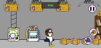
Pick up packages from the package center at Seagull Express. Each package has information on it that indicates where the customer is located, the delivery fee, etc. Beware! Picking up more orders will make you tired so you won't fly as fast! If you would like to become a top-notch deliveryman, you need to deliver the packages safely and use that income to purchase upgrades!
Download
Development log
- PostmortemMay 06, 2022
- Development LogMay 06, 2022
Comments
Log in with itch.io to leave a comment.
I like the simplicity of the game as well as the different ways the player can progress as they spend more time on the game. The sprites and the hand drawn characters and backgrounds really fit in with each other and I like how there is a goal for the player to reach throughout playing the game. It really feels like something that is polished enough to be on the app store.
This game was really cute. The animations kind of remind me of a game I used to play when I was younger and honestly, I think a game like this would have huge success in the game market. There were some little details in the game that just tied your whole vision together. The game was really in-depth and also very easy to play. I say it was a job well done.
This sounds small but I really like the transitions between each of the scenes it gave the game an extra level of polish. Additionally, the upgrades we're really nice to see implemented and it gave me an incentive to keep playing. The only thing I think could use some improvement is some of the menus look like they could use a touch up.
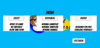
I really enjoyed the graphics of your game. The animations were great and the backgrounds really fit the theme of the game. Having different player modes was also a nice addition to allow many different types of gamers to play your app. The transition screens were beautiful and I love that each different drop off site had a different scene, as you could have just made it simple and kept the drop off site on the map.
The sprite work is very detailed and immerses you into a very cartoony-looking world. I also enjoy the top-down perspective when delivering packages. One of my favorite parts was the fact that you guys had an easy, medium and hard mode which made it feel like an official game.
I liked how in-depth this game was. I also playtested this game and thought the UI has improved quite a lot. Some of the graphics look a bit weird to me, especially when walking. However, I really think y'all put a lot of detail into this game especially with the ability to choose game modes. Really good!
Great game! The art style is neat. The ability to pick easy, medium, or hard mode is really cool. The gameplay is very fun and also I enjoyed the little details such as the writings on the packages.
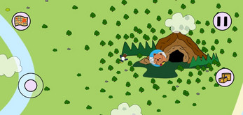
The game looks amazing! I thought it was super well done! I love the idea of having a map in order for the player to know where it has to go in the world. I also like the possibility that there are different difficulty choices at the beginning so the player is able to familiarize themselves with the game before playing a more challenging level. Overall, great job!
The art looks amazing! The variation and level of detail are mind-blowing. I love the way the seagull walks! Looks very clean. Also, the map is really well made and helps gameplay along.
One criticism is certain borders have rounded edges while some are square so I would suggest being more consistent with that.
Maybe in the future, if you develop further you can add more characters to play as!
I thought this game was really unique and liked how there were different modes to choose from. The package information was pretty detailed and I liked the use of the continuous time that helped to determine if you successfully delivered a package.
I really like the entire concept of the game. I think the sprite work is really well done. Everything from the beginning level to the minimap is really cohesive and visually appealing. The difficulty option at the beginning was also a really good idea to reach many more players than most games do. Overall, everything was just really well done.
One thing I liked most about this game is that it is very details oriented. There are many actions of the seagulls, including running, flying or even being idle. In addition, the upgrade system, assignment system, mini-map, all these things make the game more complete and worth playing repeatedly.
Overall a very interesting game with innovative theme and cute characters and different kinds of missions make the game worth playing multiples times,
I really loved the art and animation in the game. It looked so polished and all the transitions were smooth. The map function was really cool and loved how each location has specific theme to entertain the player. I also think the UI buttons were very well developed and straight forward so player can easily play this game. Really loved the idea and implementation. Good job!!!
I really like the aesthetic of this game. The sprites, the fonts and music match each other so well. I like the map system because it can give me a clue about the direction I need to go. The difficulty selection option is useful and players can spend more time on this game, trying different difficulty levels.
The fact that almost if not all artwork in this game is original is impressive! Everything is visually appealing and I can see how refined this game is. The switch in gameplay from flying around and avoiding obstacles to walking and delivering packages keeps the game feeling fresh! The only thing that sticks out to me is the difficulty selection screen. The strong white backdrop for each button feels out of place. I think a very translucent black backdrop would fit better and allow players to see your beautiful splash screen!
I love seeing the development of this game from the alpha to beta to the final version. You guys did an amazing job making this a fully flushed out game. When I first saw it, some of the sprites were not consistent in their style and I'm glad that it all worked out.
The game feels complete and has a lot of interesting features. The transitions between scenes are really smooth and the minimap was a really nice addition to the game that lets new players learn the map. The multiple dialogues that comes from the status of the package is also super nice.
The amount of polish that went into this game is insane, I especially like the hand-drawn buttons and how well they fit with the rest of the game's art. The only suggestion I'd make is to make a hand-drawn background for the menus so they also fit with the game's art style.
This game feels so so complete, from the minimap, the transition between the scenes, the pause and resume button, and the unique artwork style. I really loved the part when the seagull bumps into the cloud and bounces back a little with the sound effect. This game has so much to play with and I really loved it.
So cute! I really like how the design fits together very well. This is extremely user friendly, and seems super fleshed out. I would recommend for the integrity, instead of going to the hundredths digit, whole numbers might be easier/fits the user-friendly concept better.
Really love how well designed this game is. The most fascinating part to me was the mini map and how the red marker adjusts to your positioning. Also the animations were really spot on and I loved the little details such as the eagle animation which was nice. You guys absolutely killed it. Also really liked how there's different difficulties for the game as well.
I loved the polished designs and animations/sprites. I really appreciated the small details like the tape corresponding to the type of package and the mini map feature!I think it would be worth to explain the goal in some starting scene because there are lots of moving slides. For example, the details regarding individual packages is not fully understood (integrity, etc). The clouds could look a little more dangerous as they end up providing damage but don’t look harmful at first.
This game was super cool and very polished. I really loved the map and you can tell that you all put a lot of time into building it. I would like to see for future revisions maybe some reworking of the sprites, as well as making the text a little more obvious. Maybe less big white boxes and more visuals for backgrounds. Other than that the mechanics were perfect.
I really like the interaction buttons for the game. The color of the sky regarding the time are really detailed and the little map for each scene is really user friendly which provides better user experience. I really like this polished work since the sprites are so cute and the game looks really professional.
I love the idea of the game! the seagull animation was really cute and the time system is really cool. I like how the UI changes according to the time too! I was not really expecting to get damage from hitting the cloud so I felt like that was not very intuitive. I also love the transitioning between different scenes. Overall great work done!